On the day the opposition parties led by Congress had called for a nationwide bandh protesting high fuel prices, BJP’s Twitter account decided to counter the claim of opposition. For this, they tried to explain that actually, the increase in prices of petrol and diesel during the current government is less than the corresponding increase during UPA government by using the best method to represent numbers in an easily understandable way, graphs. But while doing so, something went wrong, and the graphs they posted became a subject of a joke on Twitter.
First, let us see the graphs posted by the party:
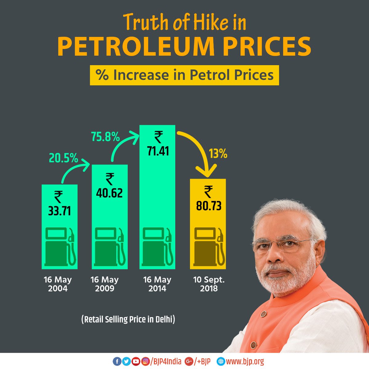
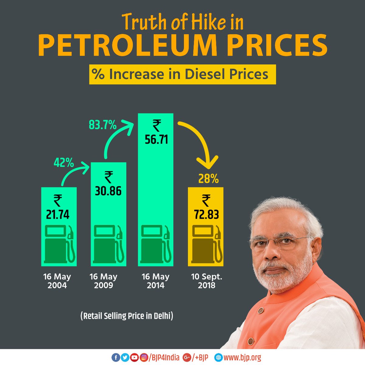
As most people have noticed, the graphs are not correct.
It has two different data series: the price of fuel and the growth rate of the price of that fuel, at four different points in time during the last 14 years. And it is indeed correct that the growth rate of price during the term of current government is less compared to the previous two UPA governments.
Now let’s take the petrol graph. Petrol price has risen by 13% during NDA government, while it rose by 20.5% during UPA1 and a whopping 75.8% during UPA2. But while trying to emphasise on this fall in growth rate during NDA government, they decided to reduce the height of the last column. But perhaps they forgot that the columns are representing the retail price of the fuel, and they have even included the retail prices as data labels on the columns. Even if the price has risen by low percentage, it has still risen, so the height of the fourth column can’t be less than the 3rd column. While data is showing that price in 2014 is more than the price in 2014, the altered size of the last column indicates the opposite, which is not correct.
Hence, while BJP is correct in pointing out that price has increased at a much lower rate compared to the previous two UPA governments, they could not visually represent it correctly.
No wonder the graphs become subject of criticism, mocking and jokes from people of all ideologies. Congress’ Twitter handle didn’t let this opportunity go and they tweeted their own version of the graph. They added another data point, international price of crude in US Dollar at the corresponding points of time. And they also decided to remove the growth rates, as that did not suit them, focusing only on retail price vs crude price.
There! Fixed it for you @BJP4India#MehangiPadiModiSarkar pic.twitter.com/kbKBjUi0M7
— Congress (@INCIndia) September 10, 2018
So, what could have been the best way to emphasise on the fall in growth rate of fuel price? Well, such graphs correctly depicting the scenario using the same data were already circulating on social media.
This was tweeted today afternoon, and this correctly represents the data.
Interesting comparison of Petrol-Diesel prices during UPA and NDA time. While in UPA 2 Petrol prices were increased by 75.8% in five years, it increased by 13% in NDA. Diesel price increased by 83.7% in five years of UPA2 and 28% in NDA. #BharatBand pic.twitter.com/i6kjZTd1MQ
— Akhilesh Sharma (@akhileshsharma1) September 10, 2018
Another user had taken the BJP’s graph and ‘corrected’ it, enlarging the height of the fourth column to match with corresponding data.
Petrol Prices hike. How resonable is for us to think that such modest hikes won’t even happen? pic.twitter.com/MxGjPsVaWH
— Vikas Pandey (@MODIfiedVikas) September 10, 2018
Yet another user went ahead and created a graph from scratch using the data used by BJP, but by plotting them correctly in a proper graph.
Dear @BJP4India, I have made a chart for you which conveys clearly what you are trying to say. Feel free to use. pic.twitter.com/PKWwzG2Xx5
— Raju Das | ৰাজু দাস (@rajudasonline) September 10, 2018
At the time of writing this report, the BJP’s Twitter account has not deleted the tweets.
